The Common ASM is not an independent ASM but part of the following ASMs:
- Presence ASM
- User Input ASM
- Native Biometric Authentication ASM
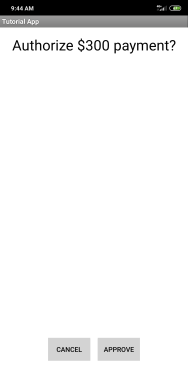
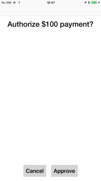
One of the crucial features of the Common ASM is to provide a transaction screen to the authenticator. This transaction screen displays the transaction text at the top of the screen, with a font adapted to the screen resolution. The text is centered horizontally, and it is possible to scroll the text if required.
Two buttons are displayed: the approval button on the right and the cancellation button on the left. These buttons are displayed at the bottom of the screen and are always visible.
Dependencies
To be able to use the Common ASM, you have to link it and its dependencies to a project. Use the following code to configure these dependencies in your application’s module build.gradle file:
repositories {
google()
maven({ url '<path to your repository>' })
}
dependencies {
api files ('<path to library>/FIDOUAFCommonASM.aar')
api "com.noknok:ak_uaf:<current NokNok Android version>"
api "com.noknok:asmsdk_uaf:<current NokNok Android version>"
api files ('<path to library>/DeviceBindingSDK.aar')
api files ('<path to library>/SecureStorageSDK.aar')
api files ('<path to library>/UtilitiesSDK.aar')
api "com.google.android.material:material:1.4.0"
api "androidx.annotation:annotation:1.2.0"
}
The local maven repository is included in the FIDO UAF SDK package and located at
NokNok/App SDKs/Android/Version current Android version/app_dev_and_eval_current Android version/AppSDK/android-studio/m2repository.
The Device Binding SDK, Secure Storage SDK, and Utilities SDK are included in the OneSpan Mobile Security Suite product package.
For more details how to integrate Secure Storage SDK, refer to the Secure Storage SDK Integration Guide.
Customization
To facilitate the customization, you can use the default resources from the package (FIDO UAF SDK /Android/ Common ASM/Values).
Tutorial App—Transaction Screen on an Android Device
Strings
The following raw string values can be customized via the strings.xml file:
Colors
The following colors in #argb and #rgb hex format can be customized via the colors.xml file.
| Key | Default text | Description |
|---|---|---|
| vds_asm_common_transaction_text_color | #ff000000 | Text color for transaction |
| vds_asm_common_transaction_background_color | #ffffffff | Background color for transaction screen |
| vds_asm_common_transaction_button_approve_text_color | #ff000000 | Text color for approval button |
| vds_asm_common_transaction_button_approve_background_color | #ffd3d3d3 | Background color for approval button |
| vds_asm_common_transaction_button_cancel_text_color | #ff000000 | Text color for cancel button |
| vds_asm_common_transaction_button_cancel_background_color | #ffd3d3d3 | Background color for cancel button |
Dimensions
The following dimen-type dimensions with values like dp, px, or sp can be customized via the dimens.xml file.
Dependencies
To integrate the Common ASM, add the following dependencies to your app:
-
FIDOUAFCommonASM.xcframework (linked framework and libraries)
-
FIDOUAFCommonASMResources.bundle (linked framework and libraries)
-
MSSDeviceBinding.xcframework (embedded framework)
-
MSSSecureStorage.xcframework (linked framework and libraries)
-
UtilitiesSDK.xcframework (linked framework and libraries)
The MSSDeviceBinding, MSSSecureStorage and UtilitiesSDK frameworks are included in the OneSpan Mobile Security Suite product package.
MSSDeviceBinding and MSSSecureStorage frameworks must be set to Embed & Sign in your Xcode project or there is a risk of your application terminating unexpectedly.
Customization
Tutorial App—Transaction Screen on an iOS device
Customization keys
The following keys are available for the customization of this authenticator:
Dark mode support
The Tutorial App is delivered with a storyboard called FIDO_UAF_Common.storyboard (see Tutorial App—Common Storyboard).
Modify this storyboard to customize fonts and colors. The Dark mode is managed by declaring named colors in the Assets catalog Images.xcassets. The storyboard takes over the string customization of colors as soon as it is added in the integrating project.
This feature requires iOS 11 or later.

This storyboard contains several links to outlets that are defined inside the FIDOUAFCommonASM.xcframework. These links cannot be restored if they are removed.
The error in the storyboard (see Tutorial App Common Storyboard—Error Message) is displayed by default and does not indicate that the compilation has failed.